General customization
You can customize the chat widget to match your brand and user experience. You can change various aspects of the chat widget including both the appearance and behavior.General customization code
General customization code
Enhance your chat flows with Plain’s data model
Plain’s chat widget is designed to be flexible and powerful. You can use Plain’s data model to enhance your chat flows, providing a more tailored experience for your users and improving your ability to triage and respond. You can currently set the following fields on threads created from the chat widget:- Labels
- Tiers
- Tenants
- External IDs
All threads
Providing a top-levelthreadDetails object in the Plain.init function will set these fields on all threads created from the chat widget. You could, for example,
set a label based on the page the user is on.
Thread details code
Thread details code
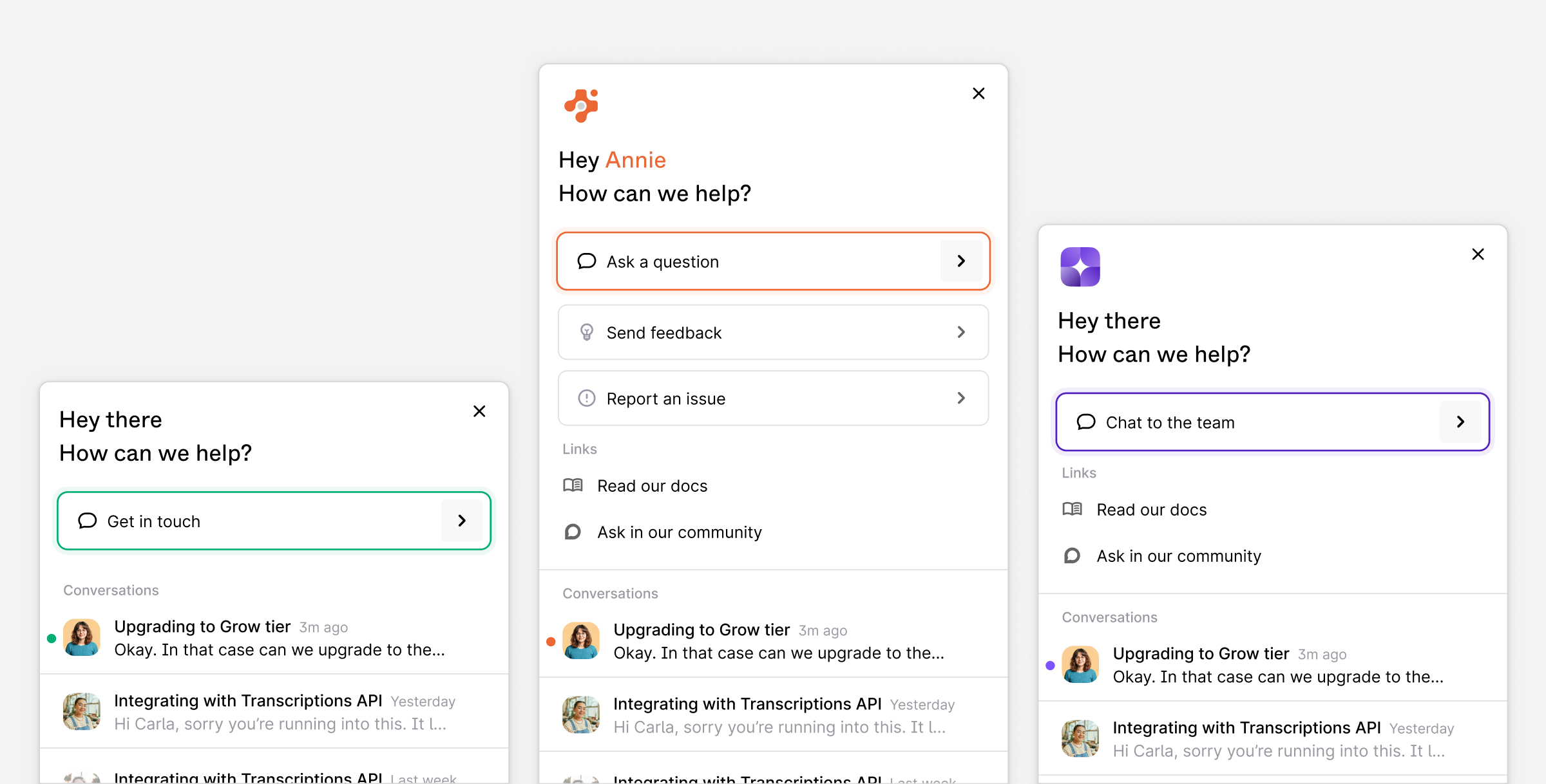
Chat buttons
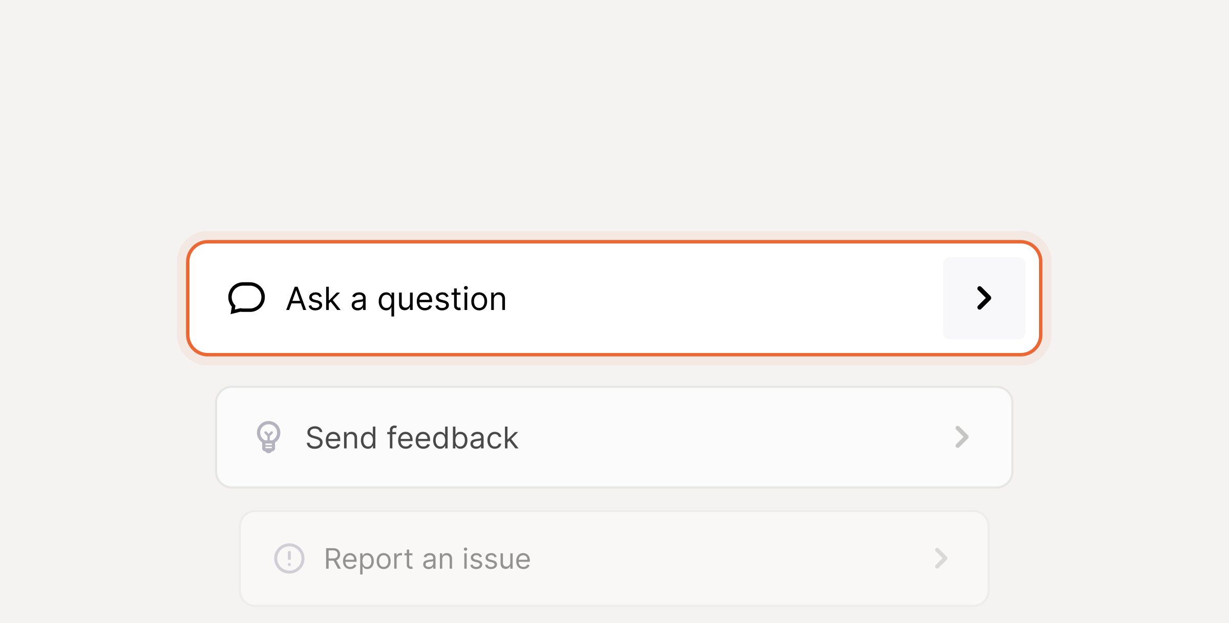
chatButtons array.
You can also pass threadDetails to a chat button to set fields on the thread when the user creates a chat from that specific button. If you provide the same field
in both the top-level threadDetails and a chat button, any single value fields will be overridden by the chat button and any multi-value fields will be appended to.
Chat buttons code
Chat buttons code
Chat forms
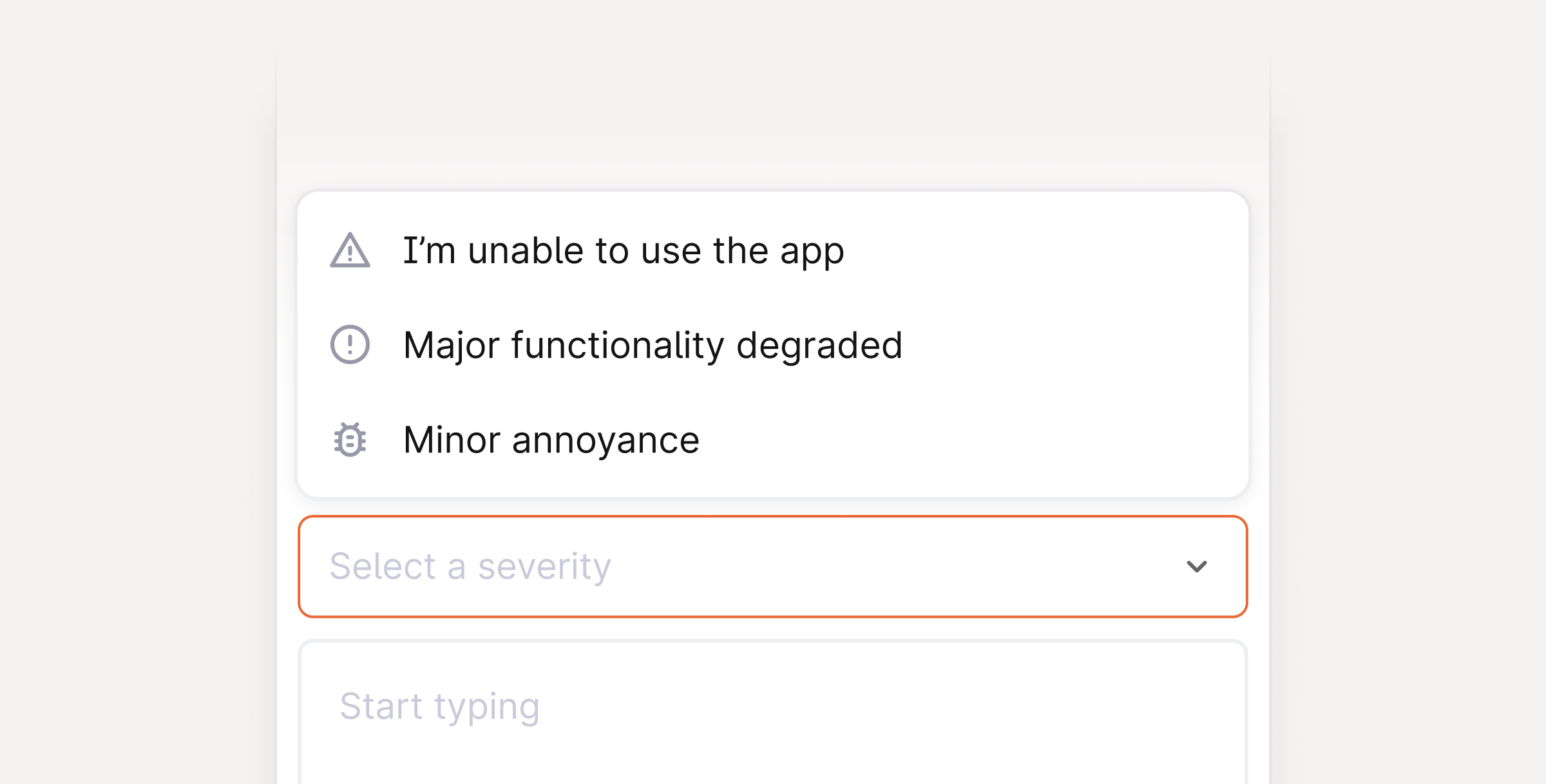
chatButton.
Chat forms code
Chat forms code
Additional methods
We provide additional methods on the Plain object to provide more control over the chat widget. This may be helpful to keep the chat widget in-sync with your existing application state.Chat forms code
Chat forms code